As I continue the process of painting the Minor Arcana I am constantly amazed by the genius of the Golden Dawn Color Scales. (The chart is from Lelandra.com, and I find it a good one barring monitor differences as colors can be hard to accurately portray online) In this post I’ll walk you through the process of painting the card I’m currently working on, which happens to be the Eight of Cups, Indolence. In a future post I’ll share with you my explanations of the scales; what the different scales are and what they mean, and some personal thoughts. It is a big, worthy and fascinating topic, and very illuminating. This post goes into the steps I personally use both to choose and place the colors and some technicalities of color mixing for artists. But also towards the end I mention an interesting peculiarity of the Golden Dawn color scales that involves the sign of Pisces in particular, and what it means for us as we move from the Age of Pisces to the Age of Aquarius.
What has been so amazing about this process, to me anyway, is that as I set forth to paint each decanic minor card, the color of the sephira for that world, combined with the colors of the astrological sign and the planet ruling that card’s particular decan, are perfectly fitting and appropriate for the subject matter and imagery of the card. This confirms for me the validity of the received imagery, as it wasn’t consciously planned.
So far, every card has been thus. The colors, even the odder flecked and rayed colors of the Princess Scale, each have found a congruous location on an element of the card. What is more, they work together to produce some interesting psychological, or maybe more appropriately physiological, effects and the feeling tone of the card is immediate and apparent.
Here I’ll just run through a bit of how I approach the process of painting the cards in the color scales.
First I sit down with the original black and white drawing, the two related Major cards, and a list of the colors. For the decan cards, these colors always include one color for the number of the sephira in the world, or suit. Added to that are the zodiacal and planetary colors, that correspond to the two related Majors.
At this point, it looks like this, a tabula rasa:
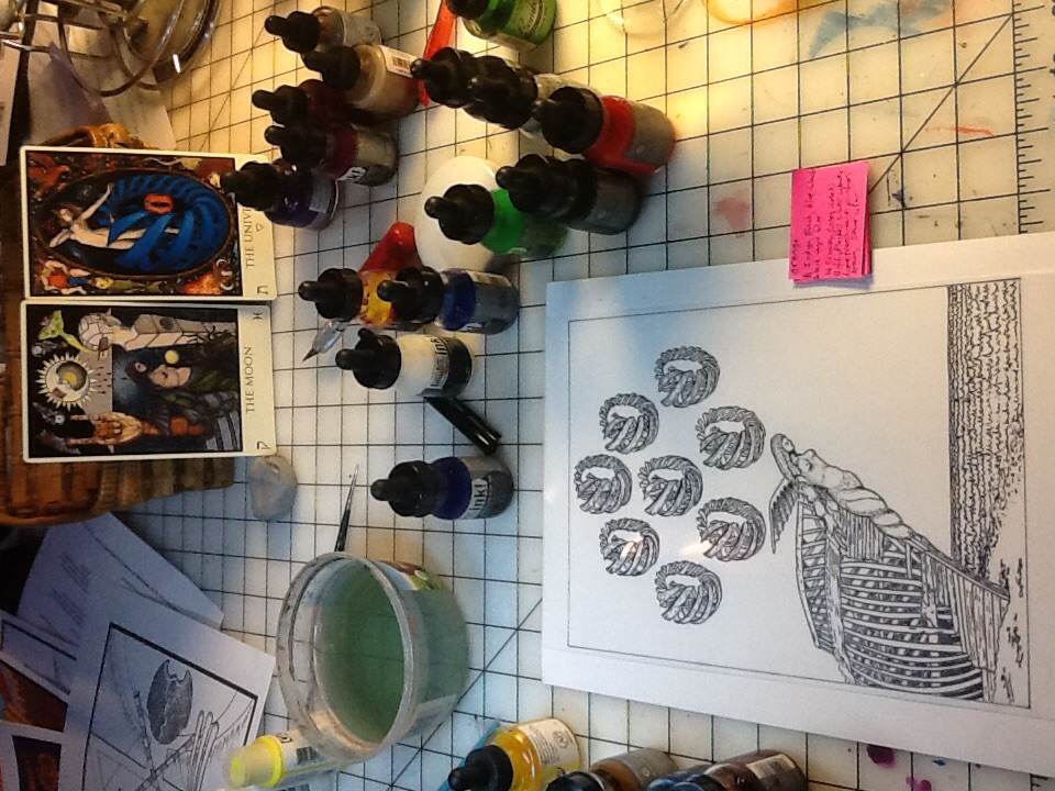
You maybe can’t see the writing but that paper lists the colors.
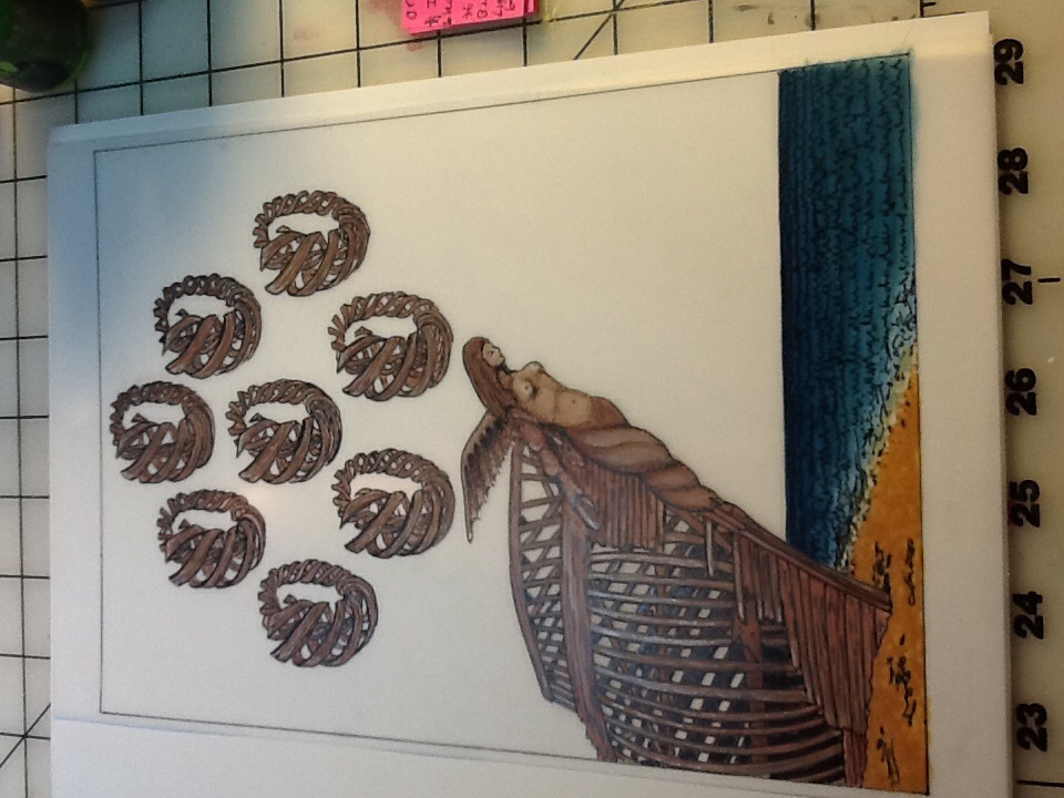
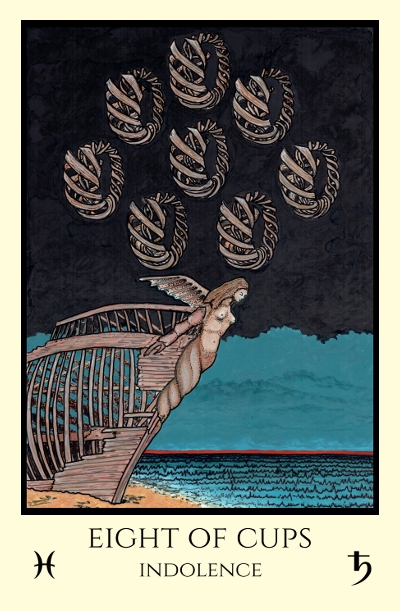
Since it is the Eight of Cups, the first color is Orange, which is the color of Hod (Eight) in the Queen Scale (Cups). What I’ve personally found so far is that in the majority of cases (but not always as there are a few exceptions) this color ends up being perfectly placed as a backdrop element of the card rather than an object.
I sit with the card’s canvas and the related Majors and the list of colors, and like magic, I see the card in my mind’s eye and know where each color belongs. In this case, the Orange of Hod in the Queen Scale will end up as the beach sand that the ship is grounded upon. It fits, as the scene will be dark, and this is a perfectly acceptable dark tone of a sandy beach at night
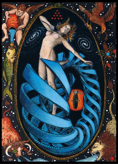
The Eight of Cups is the first decan of the sign of Pisces, and this decan is ruled by Saturn. Thus the related Majors are The Moon (Pisces) and The Universe (Saturn). (Note the Universe also does double duty and so has the colors of Earth, but for the 8 of Cups, only the Saturnine colors apply.)
The colors of Pisces, listed in YHVH order, are: Crimson (ultra violet)*, Buff flecked Silver White*, Light Translucent Pinkish Brown, and Stone. (*more on these two colors to follow, as the color scale of Pisces is an anomaly as compared to all the rest for interesting reasons)
The colors of Saturn, listed in YHVH order, are: Indigo, Black, Blue-black; and Black, rayed Blue.
Perfect for my purposes! Three of the colors of Pisces (Buff flecked Silver White, Light Translucent Pinking Brown, and Stone) layered and variegated together, will be just right to convey the sense of the weathered, bleached wood of the abandoned ship and the eight wooden spiraled cups. (The King Scale color of Pisces, Crimson (Ultra Violet), will be a surprise added at the end to complete the work.)
The colors of Saturn (Indigo, Black, Blue-black; and Black, rayed Blue) are ideal for the sky and water of the card. The water seems as if tailor made for that “Black rayed Blue”.
And as mentioned, the Orange of Hod in the Queen Scale will end up as the beach sand that the ship is grounded upon.
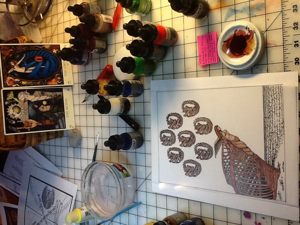
Due to the nature of the way I like to work with these inks, in layers, for the first color and layer of color I always apply the most transparent color first. In this case, the “Light Translucent Pinkish Brown” of the Prince Scale of Pisces. This is a color I have to mix myself, and to make it, I’ve taken a color called “Transparent Raw Umber” and mixed it with a little crimson to pink it up. Applied with a light touch, it is very translucent! And the fact that a little crimson was used to mix it, will harmonize it with the touch of crimson applied at the end.
Here is a layer or two of the “Light Translucent Pinkish Brown” and what it looks like so far. You can see I apply the ink thinner and lighter in some spots than others in order to mold the forms of things and add depth. You can also see what the mixed color looks like before it is applied:
On top of these first layers of the translucent colors, I will add accents and highlights of the other two colors for the wood. I start by next mixing the Stone color of the Princess Scale of Pisces, because 1) it isn’t the lightest of the three colors but the mid-tone and 2) because it was easy to mix using the color already mixed above, and adding to that some neutral grey. The result is perfectly the color shown on the chart as Stone. You can see in the palette the mixed color. I put this over the first color in spots and start molding the forms.
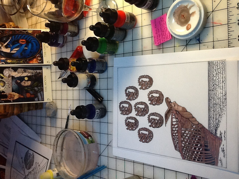
Next I mix up the next lightest color, Buff, for the next layer and add it over that, here and there on the highlights of the form. The Buff is mixed from the transparent raw umber and white. On top of the Buff, I will add the flecks of Silver White mixed from white and neutral grey. After that I add more layers of the first transparent color with the opaque colors over, the shadows being transparent and the highlights opaque. I won’t post all the stages as they look similar but you will see the final result.
After the boat and cups are done, I begin to put layers of orange, 2-3 transparent layers underneath followed by an opaque layer dotted on top, to form the sand. I also put layers of Indigo and Blue in the water, making it blue-black towards the horizon and more transparent by the shore. The interspersion of the black “brainwaves of sleep” make the color a nice black-rayed-blue overall. (The Indigo is mixed by blending Prussian Blue with some Burnt Sienna, and the Blue is the Prussian Blue alone)
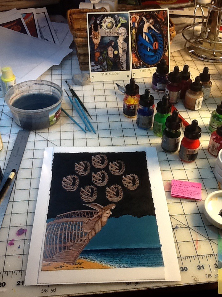
The next step is to paint the sky in shades of Indigo, Blue and Blue-black. (Note I at this point I am not looking forward to painting around all that shite! All those crevasses between the ribs of the ship and cups…)
But here it is, after several layers of the blues and the blacks and a lot of patience. To get the colors that flat and opaque with these inks takes a lot of time. At this point, the black *may* need one more perfecting layer and the indigo/blue-blackish cloud bank isn’t finished, but almost!
Last I’ll add the one remaining color, the Crimson (ultra-violet). Can you guess where it will go?
Speaking of that Crimson (ultra-violet), I find it interesting that it is a color of Pisces, the last sign. Red is a color of Aries the beginning of the signs and of the rainbow, and Red-Orange-Yellow-Green-Blue-Violet, comes a form of red again in the form of ultra-violet, the invisible ray at the end of the spectrum.
I’ll also mention another interesting thing about the colors of Pisces. If you study the color scales, you will notice that normally, the flecked and rayed versions of colors are of the Princess scale. But Pisces is the only one that instead has a flecked color in the Queen Scale (the Buff, flecked silver white). The Daughter has been put on the Throne of the Mother. This was the Golden Dawn way of calling attention to the fact that humanity was in the Age of Pisces.
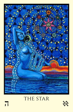
We are now considered to be in or on the cusp of, the Age of Aquarius. Whether we are there or not is often debated, but surely the New Aeon heralds this move from the Pisces/Virgo (fishes and loaves) axis to the Aquarius/Leo (woman and beast) axis. Which would mean perhaps that the colors of Aquarius may need to be adjusted to reflect this. While surely I do not feel qualified to be the arbiter of that change, I’ve recently looked at my coloring of the Star card, and for sure, in Tabula Mundi’s version of our lady of the Star, the Queen scale color of the sky (Sky Blue) is flecked with a darker blue veering towards violet. Hmmm…well, it wasn’t consciously done but it sure is something to contemplate.
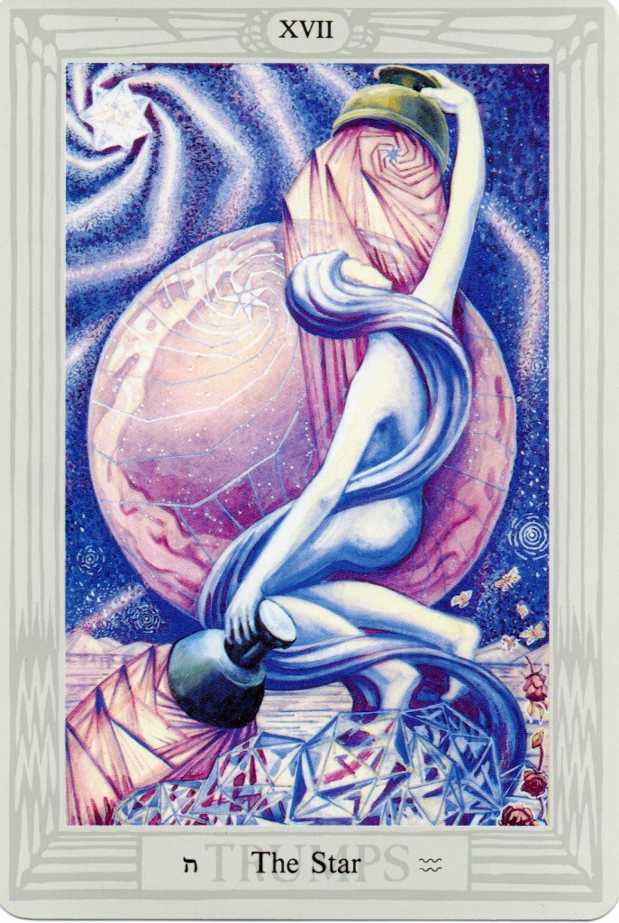
It is similarly done in the Thoth Star as well!
OK that was a digression, as after all we are still working on a card of Pisces, and only the first decan at that.
So back to the present card the Eight of Cups, the final step was to add the Crimson ultra-violet as the thin red line of the horizon, and to finish up the sky, and to bring back the outlines of the foreground objects.
Though it took a lot of work and I certainly could not be lazy about it, there was a point where I totally slacked off and procrastinated slothfully in between the stage above, and finalizing the card below. I *almost* slipped into an emotional state of lethargy and abandoned ship for a bit. (Luckily the prospect of painting the next card, Happiness, in time for my birthday this week, pulled me through!)
Behold, the end of Indolence!
Next up, I make a wish…this weekend is my birthday, and leading up to that I’ll be painting the Nine of Cups, Happiness. Plus, more to follow about the Golden Dawn Color Scales.
What brand of inks/paints are you using for this?
A couple of different ones. Mostly Liquitex Ink! brand and Dr Ph Martins Bombay, some Holbein and a few others.
Absolutely fascinating. I could just drown in that sea. What I wouldn’t give to see some of these IRL and up close! (Hint, hint.)
🙂
It is such a thrill to read about this process and see some of it in pictures. Thanks for sharing.