Hi friends! I hope the full Sagittarius moon is treating you kindly. Since it has been a while since I’ve posted anything I thought I’d give you an update on the progress of my new tarot deck. It’s been moving along very well! All of the Majors (very exactingly following the 777 Golden Dawn original tarot descriptions, main and supplemental), all of the 36 decanic “astrological faces” Minors (per the 777 “magical descriptions of the decans”), and a good chunk of court cards (using the Book T descriptions) are complete! All the Knights are complete, and the Queens are in progress.
[coming soon]
Bear in mind with these, like a full inch or inch and a half of these will be trimmed off the final image. I’ve just included it as they need extra “bleed” if I ever want to do this as a borderless tarot. It’s really only the important stuff in the middle that will remain in a bordered card.
Now just the rest of the courts to go, and then the Aces, and all of the inked line art will be done and ready to paint in full glorious color scale colors! Yeah, I saved the Aces for last this time. I intend to end on the Ace of Wands, to usher in all that creative burst I’m gonna ride when the color gets busted out!
I’m so looking forward to getting to work with color again! Pretty sure I started the drawings for this deck immediately after the launch of the Pharos Tarot majors edition into the world, so sometime between February 6-17th, 2020. Yeah, back when things were (a little) more “normal”…. before you-know and all that happened.
I’m hoping to get the rest of the courts and Aces drawings done this summer. Hopefully by sometime in July, maybe August. If I make that goal it will mean that the line art “only” took me 2.5 years – not bad at all! Especially compared to my other works and considering how much better I think the line art has gotten, and that I’m using dip pens instead of ink markers this time around. But still, 2.5 years of mostly line art has me itching to paint!
Now, how long will it take to finish the color painting…well, I can’t really say. Could be just a matter of months, maybe it will fly off the paintbrush. Or maybe it will take a year, or longer. Can’t tell until I start. These originals are twice the size Tabula Mundi’s were. Which could mean longer. Or who knows maybe it will go faster. I do nothing digitally, everything is painted by hand with a brush and art materials. Takes a while to get it right, and you can’t just click to erase mistakes! I’m leaning towards using acrylic inks again, which means something I’ve worked with before. But I also have a desire to go a little multi-media on them (think a mix of the acrylic inks with various paints and pencils).
For now, just know that things are going well and the end of the drawing stage is in sight! Which I know will be more fun for you, the viewer, as color art is always more exciting to look at on screen.
I do however think I may do a black and white edition of the 36 astrological faces aka the minors 2 thru 10 of the suits. Just for magical purposes, for those who may want them for that. Not sure though, as that is a pretty niche-within-a-niche market and black and white decks don’t sell very well, when the audience knows there is a color version available or coming. But I’ll have them available for the magically inclined, at least to some small degree.
Whatever happens, this time around it will probably have to be a Kickstarter, to raise the necessaries for printing. But that is a ways in the future, as I don’t like to do fundraisers until the art is done, so that nothing can go wrong for the backer experience.
Anyway, since it is a good old Sagittarius moon, here is a sneak peak and the ink line drawing for the card of Sagittarius, ART aka Temperance. One of my favorite cards in the deck! Here is the 777 description I had to follow – there was a lot of pretty specific stuff to get in there!
per table “The figure of Diana huntress.” continued: “A winged and crowned goddess, with flashing golden belt, stands, and pours from her right hand the flame of a torch upon an Eagle, while from her left hand she pours water from an horn upon a Lion. Between her feet a moon-shaped cauldron of silver smokes with perfume.”
[coming soon]
These will look a lot better when finished in color: the golden belt, the silver cauldron, the flames and smoke and rainbow….it all needs color to pop out. But the design and composition is solid, and considering all the things in that description, I’m super happy with it! I especially like the lion – what a chill cat, considering he is getting “water from an horn” poured upon him!
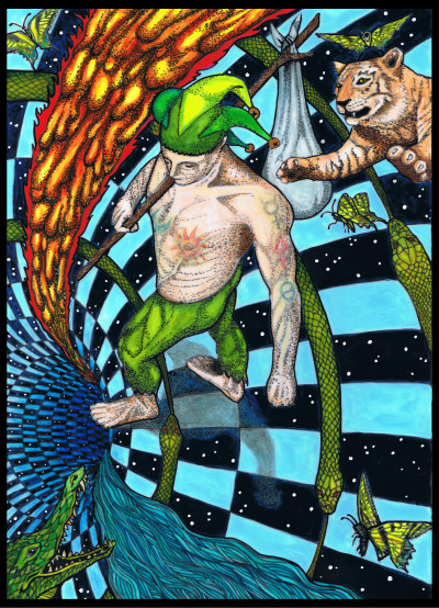
Also a card of Sagittarius, is my good old buddy the Knight of Wands, Fire of Fire, the Yod of Yod. I’ll spare you the description as it is super long and likewise specific. If you are familiar with the courts descriptions in Book T/Liber Theta you will know what I mean. I got most of it in there though. I may not have put the damn “winged horse-head” crest on every single piece of his overly described gear as it would have been a bit much, but mostly I got it all, and again some parts of the description will be added with the color painting, like the fact that the horse is black, and the mane and tail are flaming, and there will be a big red yod added onto his flaming club.
[coming soon]
Onward!
I am a huge fan of all your work- I think I have every deck and I am so excited for this one! I would also like a B&W version- I would simply buy both. I am beyond impressed that you are doing this all old school, no digital. I super appreciate it, and feel like the energetics of doing it that way really show up in using the decks. Thank you for sharing your gifts!
Thanks so much Shae! Only the Aces to go!
Hello, I did a random internet search for the symbol of a light bulb and landed here. I’m so grateful I found your website. Your artwork is spectacular! I look forward to learning more.
Hi DeAnna – thanks so much. Wow that is strange. I don’t *think* I have any art here of a light bulb – though the 8 of Wands in Tabula Mundi is a light emitting crystal, but isn’t labeled as such. Curious what image the web gods chose for you!
Love these, and would definitely be interested in b&w set of decanic minors.
Thanks for letting me know, Shel – working on the Princes now.
Mel,
These are really fine line drawings-Personally I appreciate seeing the bones of the compositions. Your queen has drawn me in! Thanks for your devotion to and patience for the work, looking forward to color land.
Thanks so much Constance! Onward and will probably begin the Queen of Disks today for the Solstice 🙂
Incredible. The linework is really superb. I would most certainly be interested in a black and white line drawing version of the sort you mention in the post. Nice work getting all those details from the description in! That Art/Temperance card is insanely cool. Excited to see this deck progress further! Peace and Love
Incredible. The linework is really superb. I would most certainly be interested in a black and white line drawing version of the sort you mention in the post. Nice work getting all those details from the description in! That Art/Temperance card is insanely cool. Excited to see this deck progress further! Peace and Love
Hey thanks so much Stefan! I’m so glad to see and hear that someone else appreciates line work, as I was really inspired at the beginning of this project to focus on that first, even though it doesn’t get the same impact on a screen. Because the bones of a thing are increasingly what I find important as an artist, rather than cramming in the tiny details that make people more impressed. I DO love working with color, and the color will bring it all to life, but the underlying composition and structure are what I increasingly feel is just essential to embodied and magically ensouled art!
Lady Harris had such strong compositional skills, paired with the geometry, though because of the watercolor medium there was not line work in the same sense as the RWS deck. With RWS, one reason the simplistic art of the Rider Waite Smith deck is so impactful, because PCS was so really good at both composition and had really strong and beautiful line work. (it’s not always evident in the modern printings, unfortunately, as they have been “retouched” to the point they lost the beautiful lines she did with a brush originally.) So I wanted to get composition and line work really down first, then go all in with fully dimensional painting.