Just an update that I’ve delayed the release of the new Pharos Tarot majors until the new year in 2020. I’m hoping to make both a bordered and a borderless version. The bordered one will have standard (Thoth based) titles, with the Pharos word keys underneath, probably looking something like this:
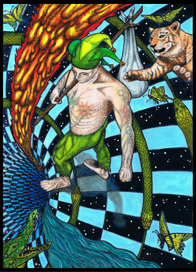
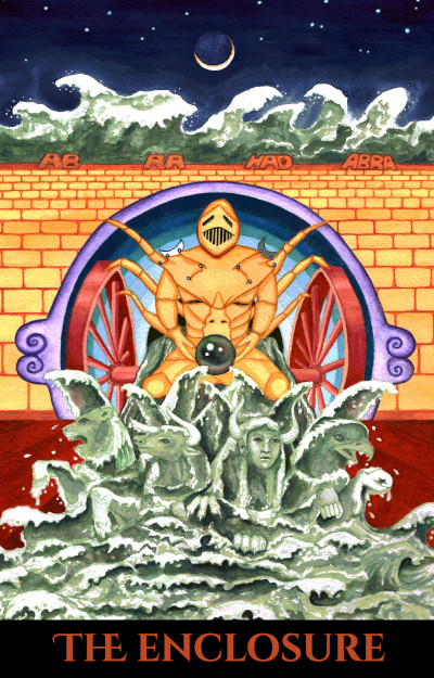
The borderless cards are a bit harder to decide on. I’m experimenting with completely borderless, or with a bottom border. Here is an example of a completely borderless Fool card, using the just the Pharos alternate title:
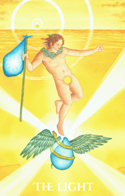
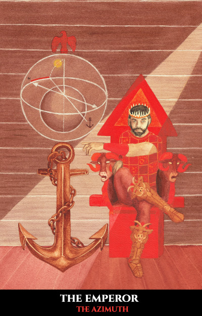
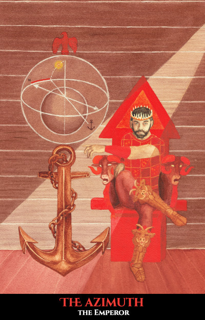
It’s also been suggested that I try using a black bottom border. I see pros and cons with this, but thought I’d try it. I could do black borders with white text or black borders with text in one of the Golden Dawn color scale colors of the card. Here are two examples, white and colored text with alternate titles on the Chariot:
I could also do the ones above with standard titles (just use your imagination on the Chariot or Fool for now).
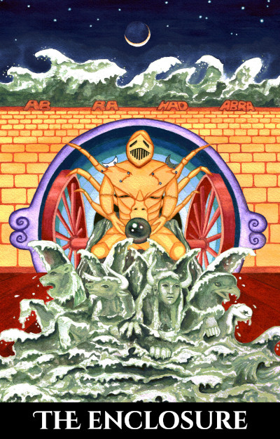
Of course I had to try one with both the standard title and the alternate word key underneath, just to see.
I’m not crazy about having both titles on the borderless ones. It looks too busy to me, which defeats the purpose of borderless cards which is spaciousness. Though it does solve the problem of getting regular titles on there, but also providing the Pharos concept titles too.
So where do things stand now?
- All of the card art is done.
- The card backs are done.
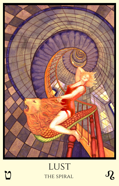
- The bordered cards are decided on (see Lust card above)
- The borderless cards, I’m still trying to decide on.
Since I’m the most indecisive person in the world sometimes, that is the next step. Meanwhile since I know about what the bordered cards will look like I can continue working on the card files to add the borders to all of them. But those borderless ones – I guess I have to decide.
I kind of like the idea of completely borderless, since the card art is sized to make that possible – and that is a rare thing. But the titles sure are easier to read on a plain bottom border. Black looks nice, though it shows wear more. I think I like them with just the Pharos concept titles, in the Golden Dawn scale colors. But I know lots of people dislike alternate titles, so it’s risky. And I’m sure some won’t like them in different colors either…
I’m leaning towards doing bordered ones like in the Lust example, and borderless ones like in the Fool example. But the Chariot example works too. Or either of those with just regular titles could work. I don’t think I like having both titles on the ones with the bottom black border, like in the Emperor, and both titles definitely won’t work on the completely borderless ones, as the font needs to be substantial to be read against the background picture.
So these decisions, plus holidays, plus working on the Fortunes Wheelhouse book which is due to come out in 2020, have made the release of these later than I’d hoped. I don’t want to take pre-orders until I have it all worked out.
Coming soon in the New Year though. My printers have a fast turn around time since I print in the USA where I’m located, so I don’t have to worry about slow boats etc. I just have to make a decision on those borderless ones so I can finish making the print files.