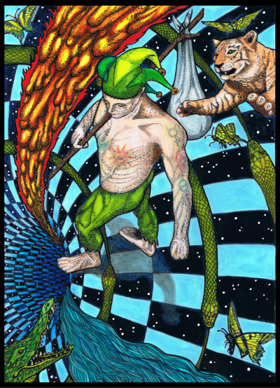
After the last post, two people asked if I could share more about the process and the materials used. So for this time, I will show you some of that. You will see some of the ugly in-between stages of the coloring process. Don’t judge anything by those; the final ones look good. What you will know after reading this is how it is a many-layered process, and truly a labor of Love. Love under Will. All you need is Love…
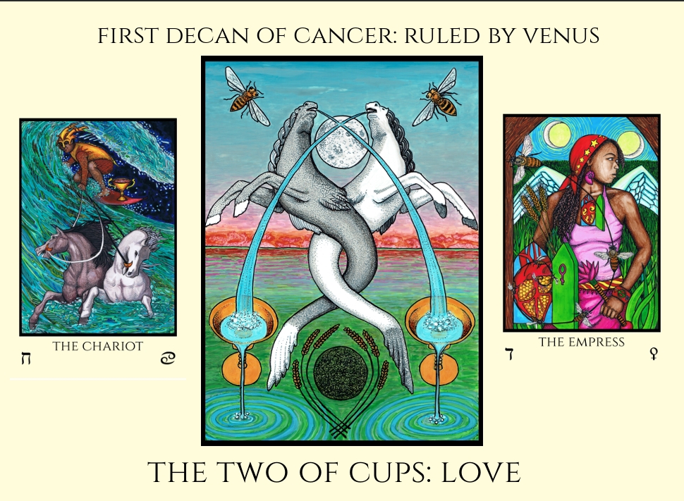
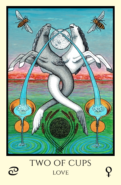
This card was actually challenging to paint. In order to use all of the colors of the color scale, before beginning to paint each card, one must decide where to put each color. The colors of Cancer include Amber, Maroon and Russet; and Dark Greenish Brown. The colors of Venus are Emerald; Sky Blue; Early Spring Green; and Bright Rose , rayed Pale Green.The color of Chokmah (2) in the Queen Scale (Cups) is Grey.
As far as this card goes, it was obvious where most of the colors went. Except for that “Bright Rose, rayed Pale Green”. I decided the only element of the scene where that could work is the sea. The sea at sunrise or sunset. That took care of that, and put the Maroon and Russet on the horizon. But it was tough to do with the media I use. A labor of love.
The original drawings are on matte Dura-lar with a fine line permanent marker. One size of marker, and one kind only. I bought a tub of them as I knew if I ran out before the deck was done, it would be bad. Not very marker behaves the same on this stuff.
They call it the acetate alternative ” a high contact clarity, translucent film with matte erasable coatings on both sides”.
It is archival, to accept “pen, lead, ink, paint and colored pencil”. It is basically a frosted mylar I guess, so it is a type of plastic, not paper, and coated with a matte coating. I love it for its half opaque/half translucent and light-transferring quality, for its durability, erase-ability, and affordability. I can sketch the drawing on it in pencil, refine it with the marker, erase the pencil, and then paint the image in colored India and acrylic inks.
The colored inks I mostly use are Liquitex Ink! professional acrylic ink, and Dr. Ph. Martin’s Bombay.
These inks are both excellent, permanent, and lightfast. But painting with them on this frosted mylar is very different from working with them on paper, both for better and worse I imagine. Because Dura-lar is a film, it isn’t absorbent so the ink does not sink into the paper, it floats on top, and when the liquid evaporates, the color is left. This, and the differing opacities of every color, make it difficult to control. Or maybe not difficult, just time consuming, as in, you can do almost anything with them, but it is going to take a lot of layers if you want it to look good and dimensional. Almost no element in this deck, nothing thing in any card, had only one layer of color on it. Transparent colors need several, opaque colors need even more, and dimensional colors need more still.
Here is a shot of the first baby steps of painting this card:
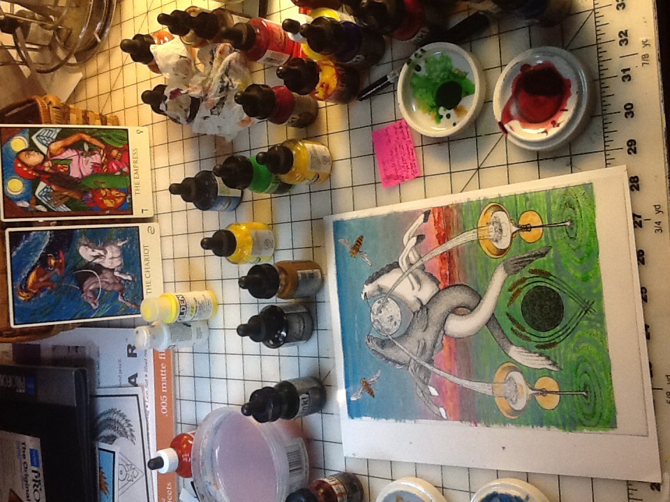
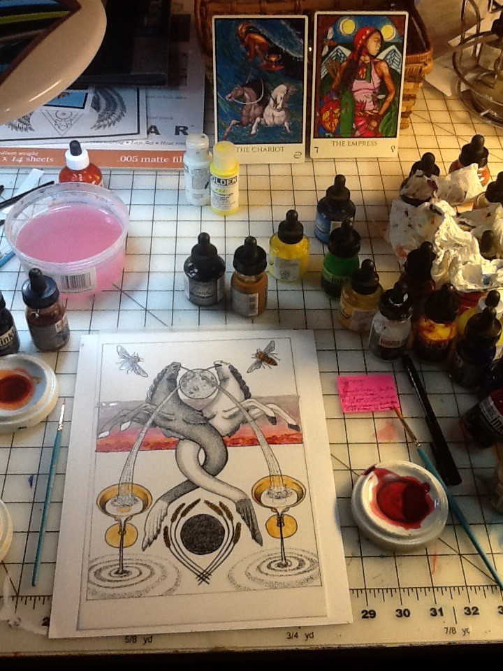 I usually put anything yellow down first, as it is a very transparent yet staining ink. So here you see the first spotty coat on the cups. I also have done the base coat for the sunrise, by puddling maroon shapes on the horizon and then removing them with a paper towl. Over that russet was interlaced, and the rose color for the sea reflection was added to the cloud layer. This cloud layer is grey, the color of the Queen Scale of Cups. Believe it or not, what little you see above is multiple layers, on every object. Down below, yet more layers, beginning the sky and the sea. These inks are a challenge to blend on a smooth, non-absorbent sheet. You can see below, the first layer(s) of the sea are ugly. It took a lot of layers to get them to the finished card. Meanwhile, they looked awful, like this:
Some of the inks are extremely transparent, some slightly opaque to varying degrees. Straight black and white are most opaque I think. All can be made more opaque with white to some degree, but the more you add the more you lighten the color. But you can darken it again with layers.
Layers, I can say again, are it. Every element, every color, is layers of ink. Probably each section has at minimum six layers and at max, infinite, as in, until I am satisfied with it. What is above is an ugly stage. Every card has one, a stage at which I wonder about my sanity, and if the colors I chose are so ugly and my skills so missing that I might have ruined it! I know now, just to keep putting on layers, as eventually all is well. The original looks better than the scan, as the sky came out just right.

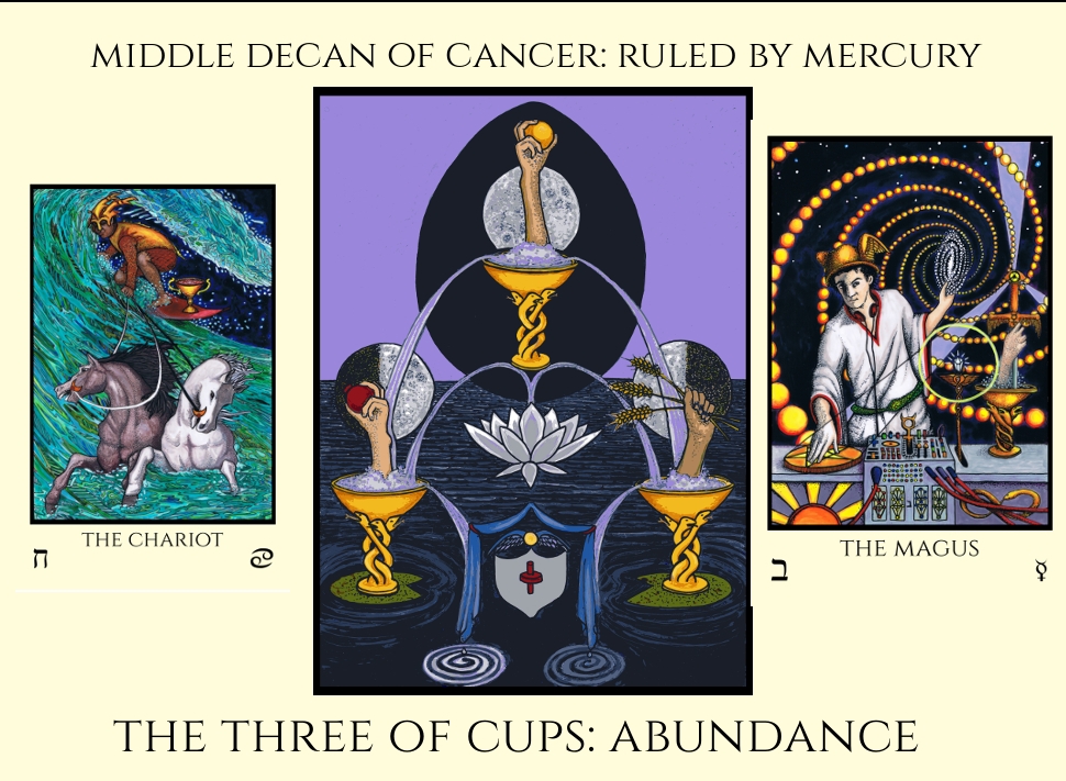
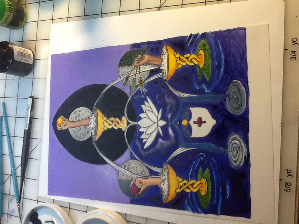
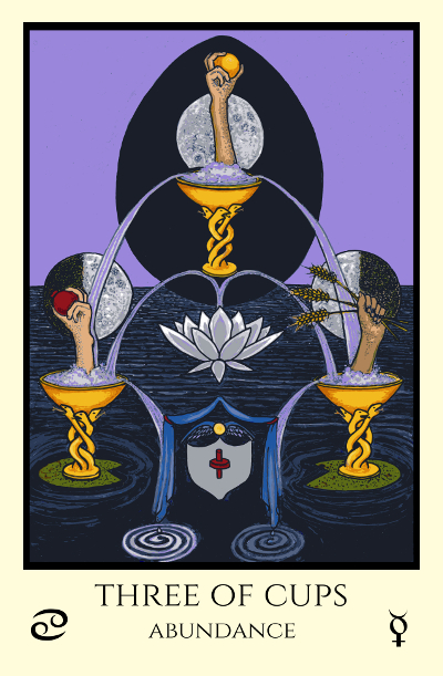
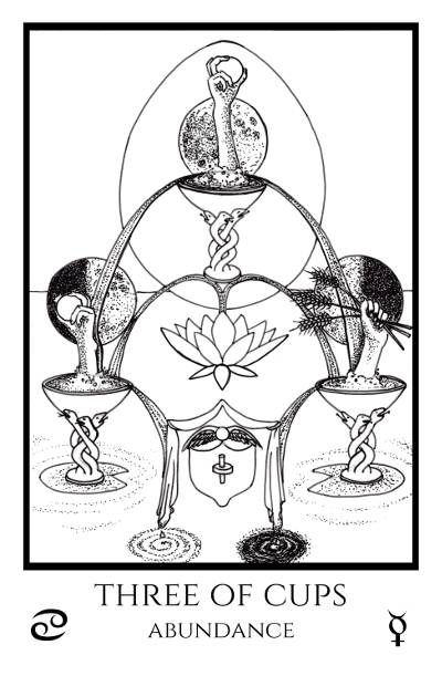
Here is a bit of the process for the next card, the Three of Cups. The colors of Cancer (Amber, Russet, Maroon, Dark brownish green) combine with the colors for Mercury (Yellow, Purple, Grey, and Indigo rayed or flecked Violet) and the color for the Queen (Cups) Scale of Binah (3) is Black, providing the big black egg or egg shaped portal in the background:
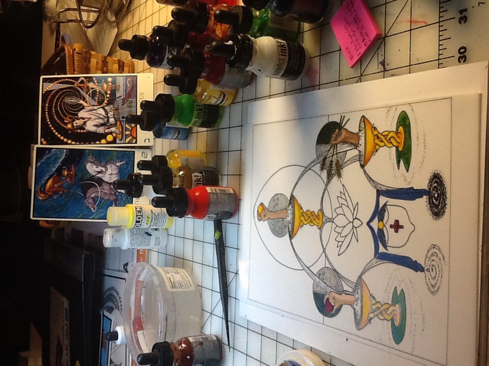
Above, the many base layers on each object. Below, an ugly stage:
 The ugly stage above is because even if I puddle up the first layer as high as it can go, the first layer is never perfect. It usually has dark spots and light areas, as the ink pools thicker in some spots. To get a beautiful smooth flat layer takes a lot of work, especially if it transitions like happens in sky or water sometimes.
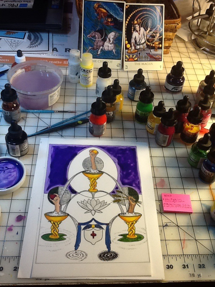
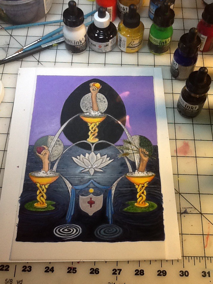
Above, the background has been given enough layers to be opaque and interestingly textured and the egg has been filled. Below ugly stage. Only the first few layers of the sea, it still looks like shite.
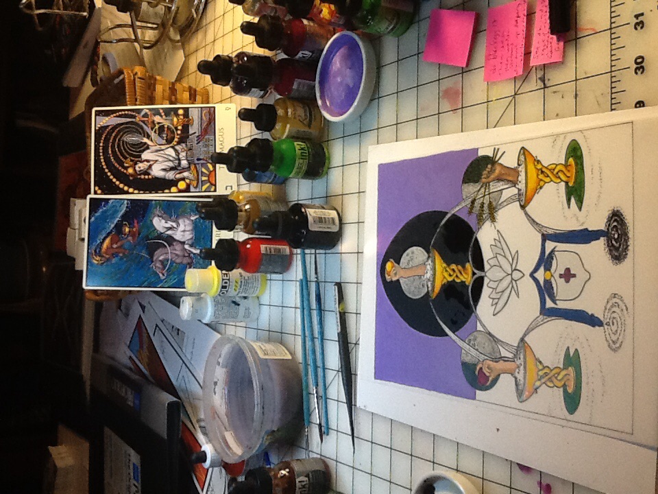
 Above is a stage where the ripples of moonlight on the ocean are being formed. Still an in between stage above; the finished card below:
I won’t bore you with stages for the next card, but here it is, the Four of Cups. Man, the color scales really worked out perfect for this one! The color for the Queen Scale of Chesed is Blue. This provides the background sky color. The colors of the Moon are very blue too: Blue, Silver, Cold Pale Blue, and Silver rayed Sky Blue. The colors of Cancer are in the scallop shell (Amber, Russet, Maroon) and also in the wave to give depth (Dark Brownish Green). As I’ve gone along I’ve been fairly amazed that the colors for the scale really work on the imagery I’ve chosen. Not planned! At least, not by me consciously!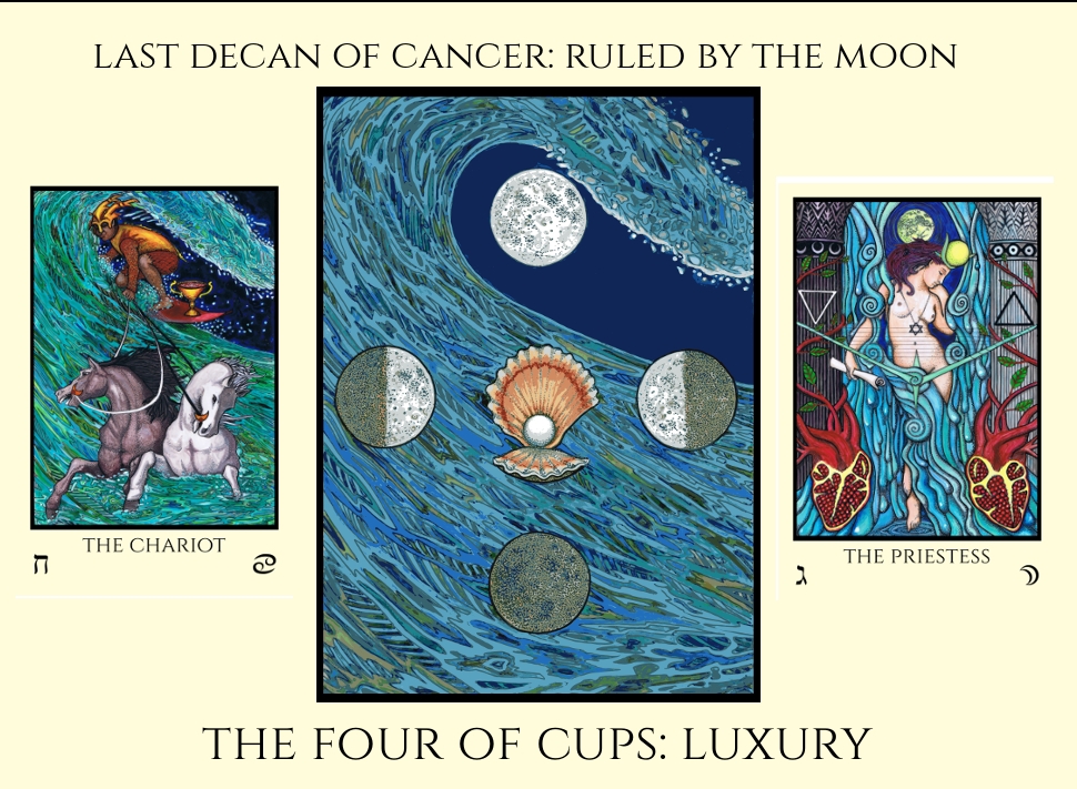
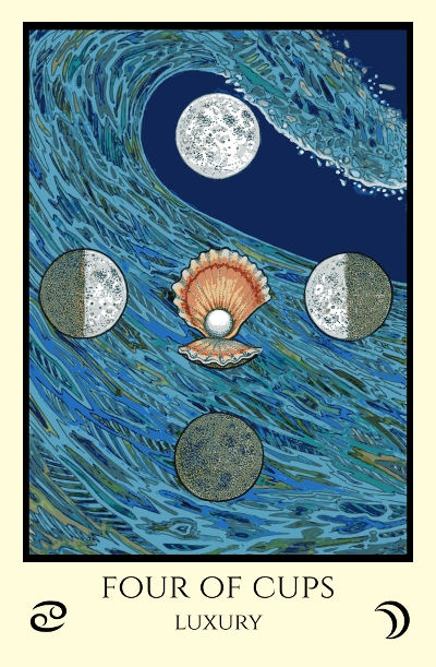
Pretty much the same process. But for some reason the Four was fun to paint. I think it was the colors, such a beautiful combo and the Luxury of using every shade of Blue!
so beautiful ~~
This is fascinating. Thank you for sharing. I have an even higher appreciation for your process. The question that begs answering: ‘When do you sleep?’
Thanks so much for taking the time and trouble to produce this “show and tell.” It was extremely interesting to hear about the materials you use and how you have to use them. Having some idea of how you produce the cards can only allow us to feel even more connected to artwork that we already feel a deep resonance with. Again, many thanks!!