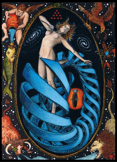
 Since the papyrus edition of the Rosetta tarot deck is a redux of the deck first published in 2011, rather than share about the process for the art itself which is already done, I thought I’d share some of the process behind the new borders being made now, because that is what is exciting to me about it. I always said to myself that if I ever did another deck printing I would not do black borders. They do look good; you can see them here. So I understand why people do, they do make the colors pop but these colors pop next to anything through the miracle of the Golden Dawn color scales. And indeed when I did my second deck, Tabula Mundi tarot, I chose a light cream color rather than black. But for another printing of Rosetta I wanted to do something more organic looking than a solid color. What better look than that of aged papyrus with hieroglyphs written with a quill pen dipped a naturally made ink?
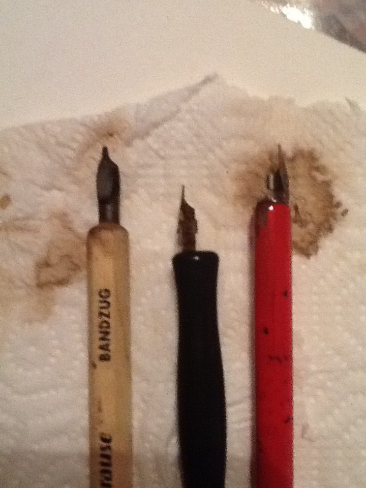
For the background I’ve used an authentic piece of papyrus. Actually several pieces! The lettering is done with calligraphy pens dipped in a walnut based ink.
 When I first published the full size deck in I offered with every deck a handmade significator card customized with a person’s name of choice written in Egyptian hieroglyphs phonetically, inside of a cartouche held by the goddess Seshet, Mistress of the House of Books. I did those in a fine line permanent marker though, not a quill pen! The pocket size decks also have this feature so I’ve still been doing them.
As of now I’ve customized over 1200 significator cards with differing names and words on them. So I pretty much can write phonetic Egyptian blindfolded. Literally as sometimes I would write them bleary eyed while having coffee before going to work, in dim AM light and could barely see; was doing them like a 50% blind person! But they are simple and perfection isn’t needed. The hardest thing was getting the word evenly spaced in the cartouche (which is a special name ring around characters indicating it is a name, usually of royalty or deity). In permanent marker one only has one shot at it. But I got really good at it over the years.
This isn’t true Egyptian language, it is sounding out the English, or other, words and writing them based on sound as matched to letter sounds. It eliminates some vowel sounds and is more consonant based. But for most of the card names it made more sense to write the recognized title phonetically rather than seeking the equivalent Egyptian word. I chose to eliminate the word “The” such as calling a card “Fool” rather than “The Fool”. The word “the” seemed superfluous, takes up necessary room in the cartouche, and also, the Egyptian’s did not have the “Th” sound, and substitute either “T” or “D”, so there for it would have been either “Ta Fool” or “Da Fool” (Pity da’ Fool!)
In addition to the letters with phonetic equivalents, they also used logograms whereby a single glyph stood for a whole word that the picture glyph represented. Most glyphs had dual purpose in that they could be logograms, phonetic equivalents or other determinatives. So the hieroglyph for the letter R which looks like a horizontal vesica pisces is meant to look like an open mouth, and also is associated with the god Re (Ra). If used as a logogram, it has a vertical stroke after it, so in this case would mean that the glyph meant “mouth” rather than the “R” sound or the god name.
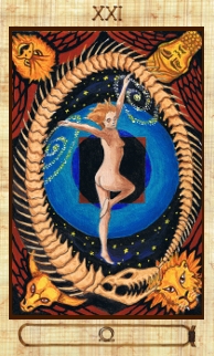
 Some card names had the perfect Egyptian logogram ready made: Star, Moon, and Sun. They have obvious hieroglyphs that you can tell at a glance mean moon or sun or star. The Universe too has a logogram that I think perfectly captures the essense of the card: the Shen Ring. This is a glyph that is like a cartouche but amounts to “eternity”, “infinity” and a never ending cycle, and eternal protection. It looks a lot like an Omega or Ouroboros too; perfect for the Universe card.
The other majors all had logical ways to sound the words out phonetically. I want the cards to be written that way so that with a simple chart of sound glyphs, you can sound a card out. The unimportant vowels are skipped but ones that make a huge difference may be written. Of course you will always know what card it is because not only is it obvious in the imagery if you are familiar with the tarot, but because the roman numeral is written at the top of the card.
 One card was a bit fun to do, and that was “Death”. Because there is no “Th” sound, to write the word phonetically one would write a glyph for D followed by either a T or another D. DD would be “Dead” not death and one hardly sees repeated consonants so that would be wierd. In English could be did or dad or dud, and DT could be Dit or Dat or Dot or Debt. If it had a long vowel central, I could have written it. But the “short” vowels generally but not always are omitted. So the word I felt needed a “determinative” symbol, which is one that indicates which of the possible phonetic meanings the word actually is. These are placed at the end of the word, and have no sound but indicate what the word is if omitted vowels render it ambiguous. So for Death, I place a determinative symbol of a coffin or sarcophagus, meaning “Dead” to indicate that the consonants “DT” I used stood for Death.
The writing itself, so far I’ve used two sizes of calligraphy dip pens, one thick and one a little less so. The ink is walnut which I LOVE. Because it goes on in varying degrees of transparency it has a huge variation in color as pressure is applied to the pen or where the ink pools up, leading to a gorgeous organic look. I’ve made an alphabet of glyphs that I can assemble in the cartouche.
Early in I realized that while not a 100% convention, that since Egyptian hieroglyphic writing can be read left or right, up or down, that as a courtesy to indicate direction (in this case left to right just like English) the animal glyphs should all be facing the indicated direction that one should start from, so I’ve changed some of my glyphs accordingly. When you see hieroglyphs, the animal or people faces will be looking at the direction you begin at; so if they face to the left, you read them left to right, and vice-versa.
I am finished with the Majors tonight then next up will be minors which you already have seen a sample of, and court cards, which will have their own convention. Deck is coming right along quickly. If you would like to be on the list to reserve a copy or just to be notified when it is available, email me at mm(at)tabulamundi(dot)com with “rosetta” in the subject line.
I am DELIGHTED that a new Rosetta edition is in the works. I love that deck & anticipate another edition of it with happy excitement!