
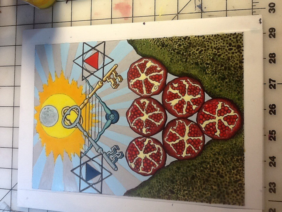
 Sometimes, color makes all the difference. Especially when the Gooden Dawn color scales fit the subject matter so perfectly. It just makes an impact. I was not going to post about this card because I did not photo document the painting process. But I wish I did because this one has been pretty fun to paint. What was fun about it was the interplay and balance of transparent and opaque colors. When there is mostly one or the other, it feels flat and takes a lot of work to create dimension. When there is a good balance of transparent and opaque it is such a joy to create that dimension. Such was the case in this one.
This is one card that really benefits from color.
The color of the six of Disks is Golden Amber, and it is the only of the numbered Disk cards that isn’t a flecked color. As the six in central and balanced Tiphareth, it is a sunny, solar, and unflecked color.
The other colors of the Six of Disks are those of Taurus, the Hierophant; and as it is the middle decan of Taurus, ruled by the Moon, the Priestess.
So the colors are:
Tiphareth of Assiah: Golden Amber
Colors of Taurus: Red-Orange, Deep Indigo, Deep Warm Olive, Rich Brown
Colors of the Moon: Blue; Silver; Cold Pale Blue; Silver, rayed Sky Blue
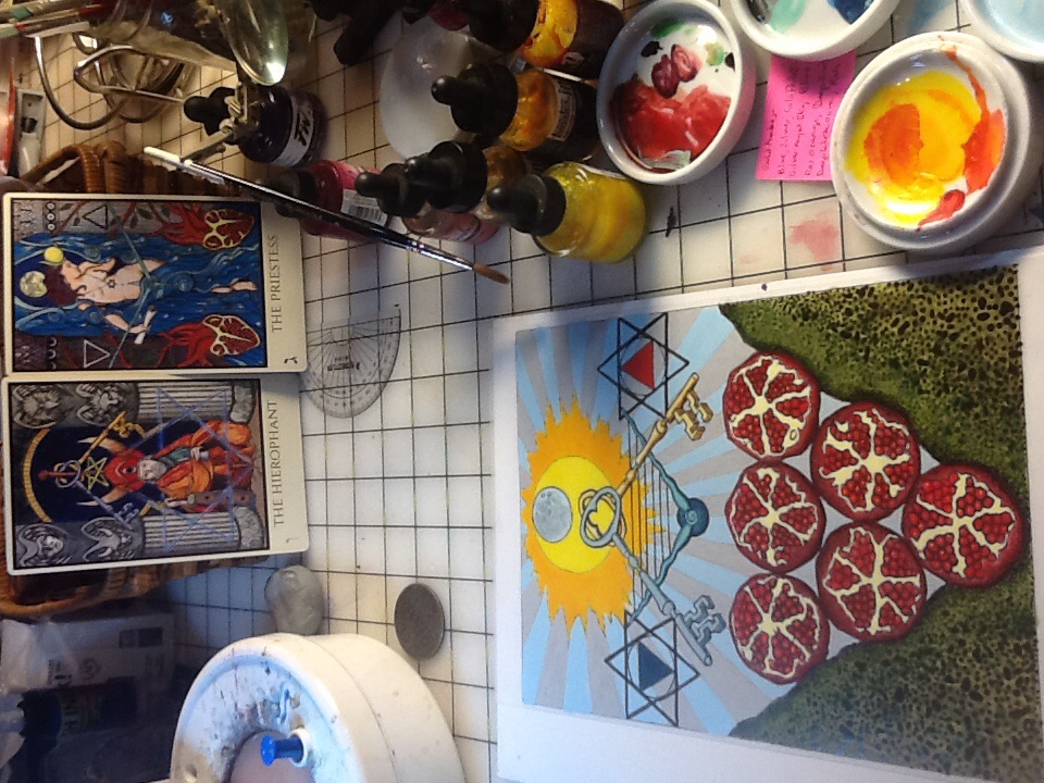
This is a picture that shows the card about 95% done. I love Thursdays; this is my day off so I was able to do almost all of the card today. It took most of the day and evening but by the time you read this I will have finished painting it – so, the sweet taste of Success!
Which means next up is Failure. Gotta go back to work tomorrow…rah roh Reorge. I will scan and post the completed six, and finish the Seven next if all goes well.
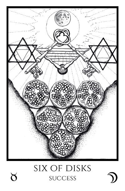
Here is the black and white Six of Disks card for comparison. You can see how in this case color is potent!
We have the pomegranates of the Priestess stacked in the fertile valley of Taurus, under the crossed keys of silver and gold, the lyre-bow, and the Moon aligned with solar Tiphareth:
You know how much I adore the TM and I am learning so much from you, via this colouring process, about the colour scales. It is just wonderful. X
Thanks Spiffo! Working with the color scales is pretty great, and I have really grown to appreciate the thought that has gone into them. They make so much sense this time around!